Smarthealth

Client
Interswitch Group
Year
2021
Service
Led end-to-end design strategy Conducted user research (primary + secondary) Defined product pillars and design architecture Built Smarthealth’s design system (Switch Core).


Overview
Smarthealth is your all-in-one wellness companion, offering essential health information and immediate medical assistance. Built on the new patient paradigm, it facilitates remote, personalized treatment through a connected and continuous care pathway. With the surge in telehealth adoption, exploring seamless integration into routine practice is crucial.
Problem
Healthcare is reactive, fragmented, and mistrusted
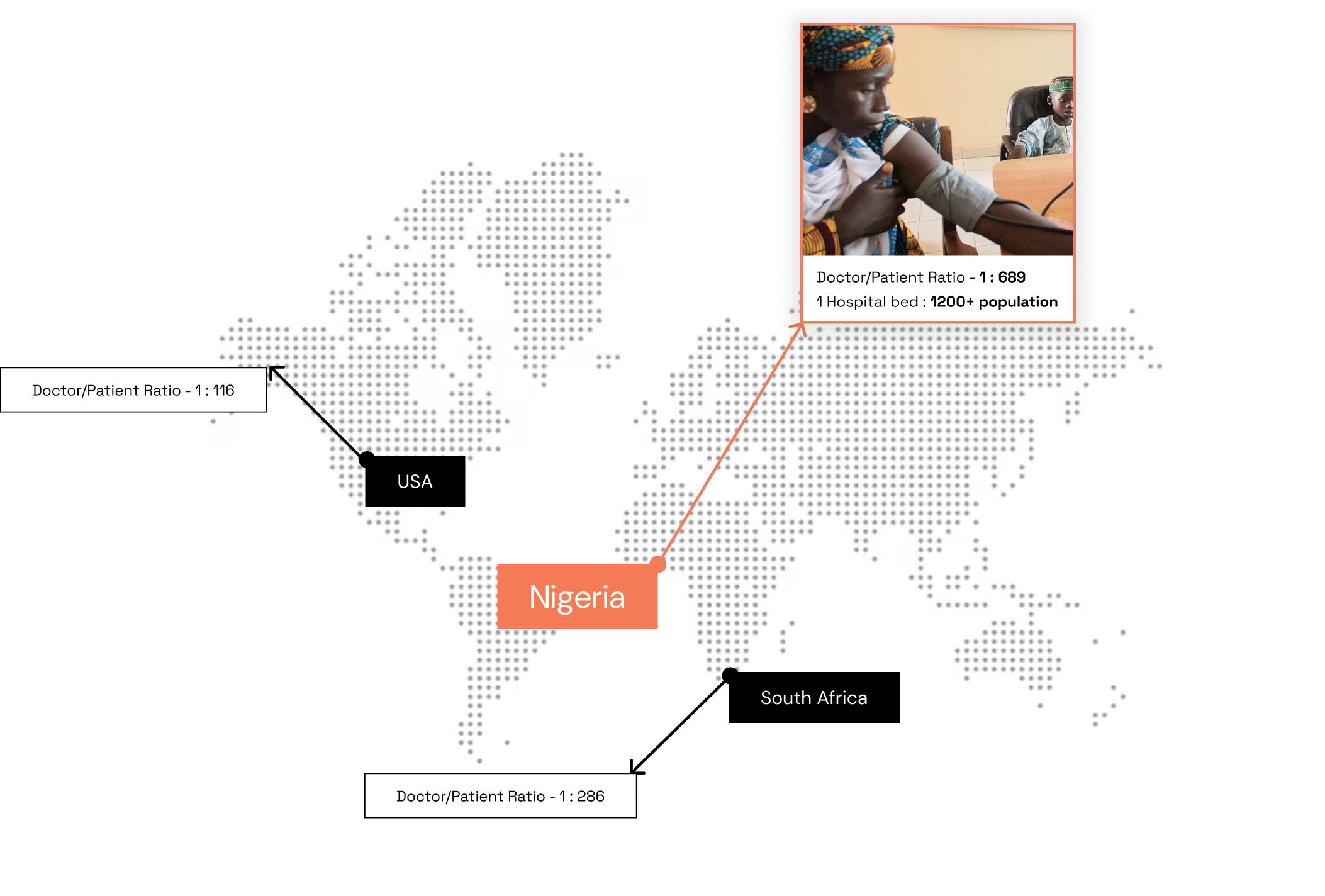
The convergence of lifestyle modernization and an aging population has fueled a surge in chronic diseases like cardiovascular diseases, diabetes, and hypertension. This, in turn, imposes a significant economic burden on healthcare systems and contributes to 70% of global deaths. We recognized that the current healthcare landscape in Nigeria is plagued with poor response times or long delays in consultation.
Highlights
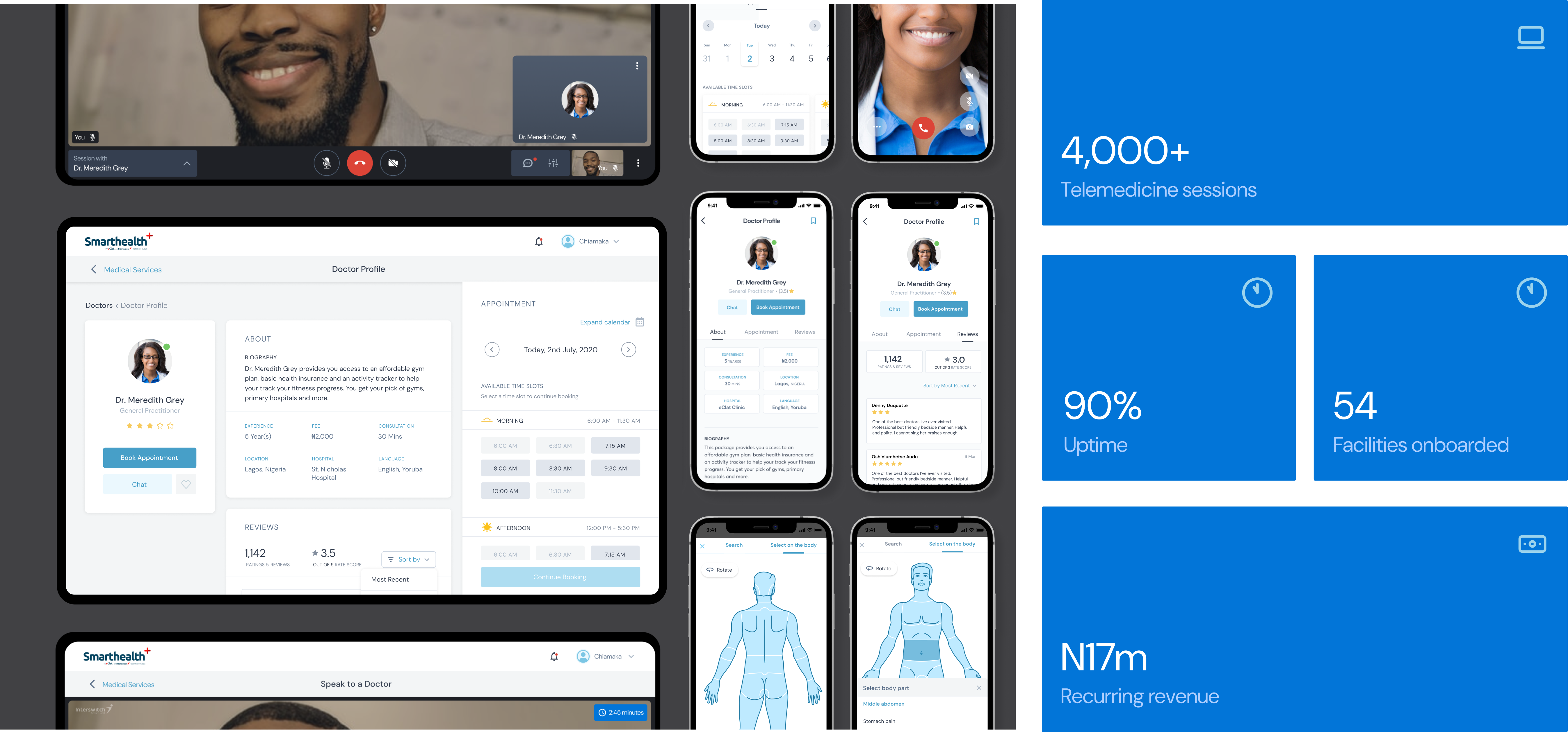
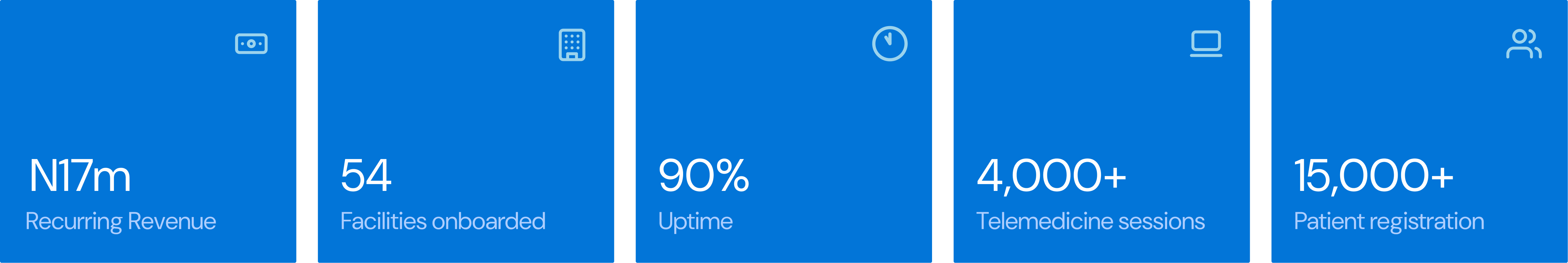
My design efforts and hands on approach contributed to over 4000 telemedicine sessions, 90% uptime and a reccuring revenue in the health technology product portfolio of 17million Naira
Nigeria's healthcare crises
Amidst a healthcare crisis in Nigeria. Interswitch Group acquired a health-tech startup to expand into Nigeria’s healthcare market. The country faces severe care gaps—low doctor-to-patient ratios, long delays, and a reactive care culture. My goal was to design a product that shifts users from crisis-based care to proactive, continuous health management.
Patients POV
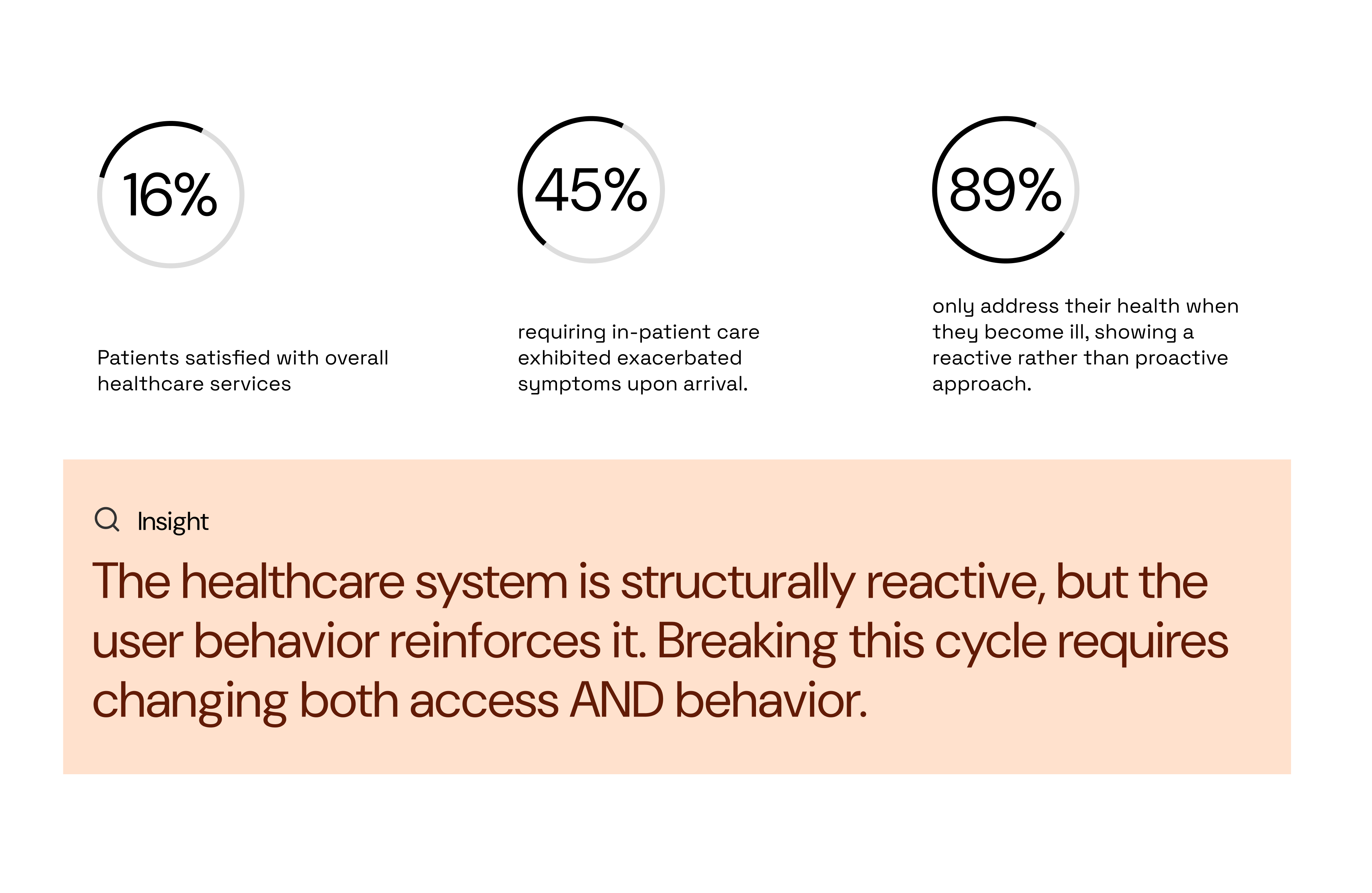
I carried out a descriptive cross-sectional study using a structured self-administered questionnaire on 200 patients (54% females and 46% males, aged between 20 and 65 years), post admission, selected by multistage sampling. Research surfaced a pattern: patients only seek help when symptoms escalate. This reactive behavior is reinforced by long wait times, inconsistent care, and a lack of reliable information.
Here were the key findings below:
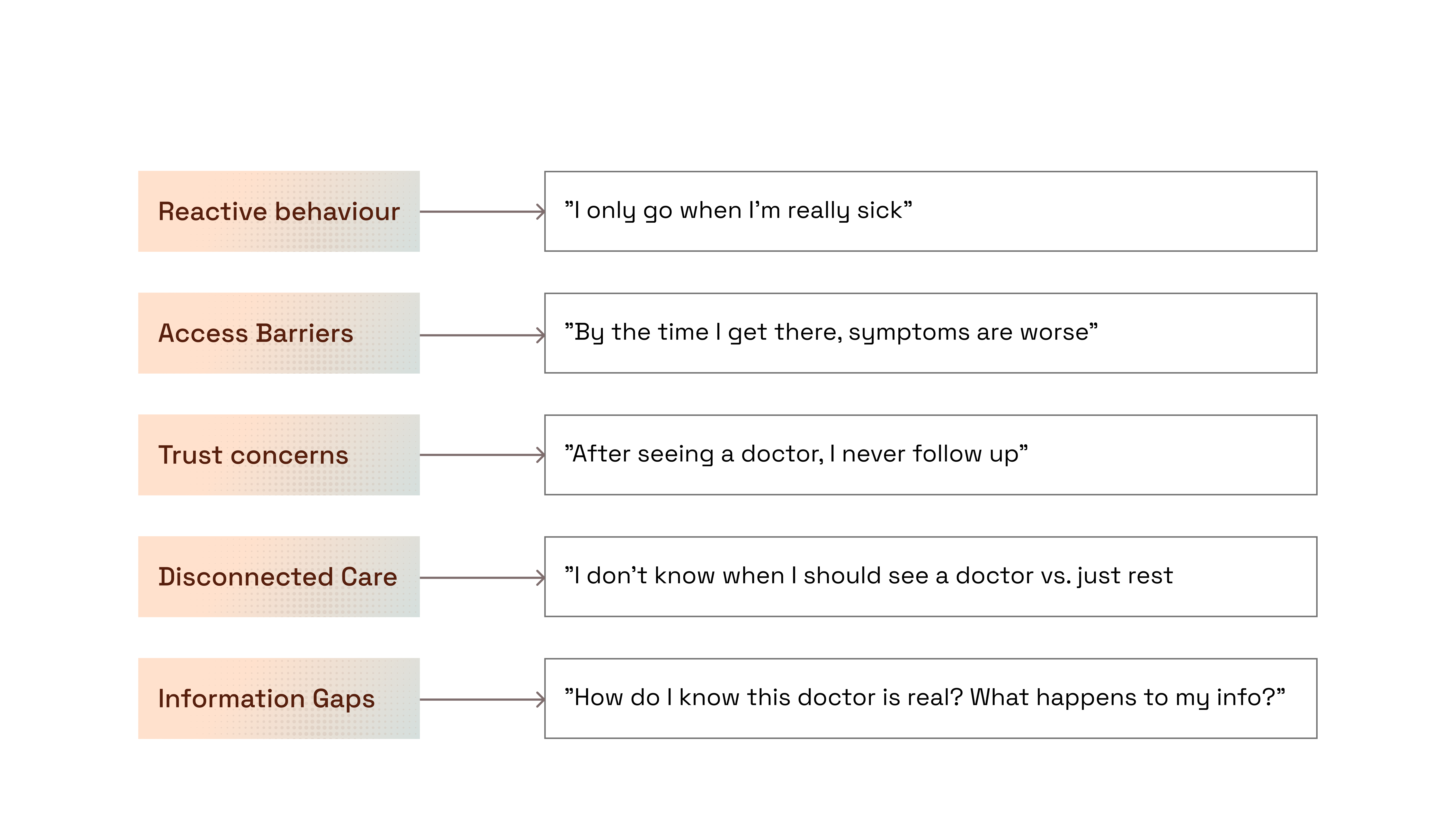
Thematic approach
I dug deeper to try to look for patterns in the transcript from our interviewees using an interpretative qualitative study. The Data was analysed using an inductive thematic approach. These insights directly informed UX decisions and our trust-building model.
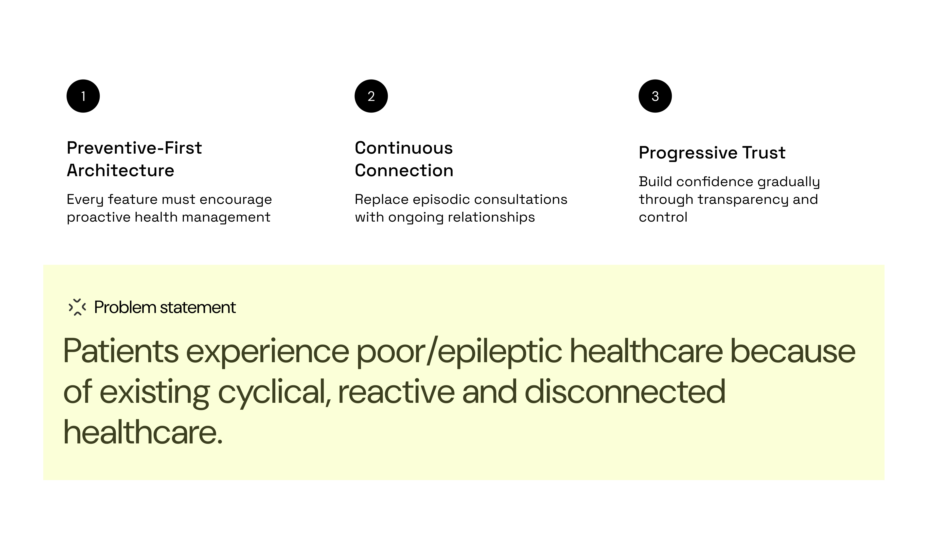
What this meant for design strategy
Reframing the challenge, Rather than simply digitizing existing (broken) healthcare access, we needed to redesign the care paradigm itself. To do this, we developed a 3-pillar design strategy:
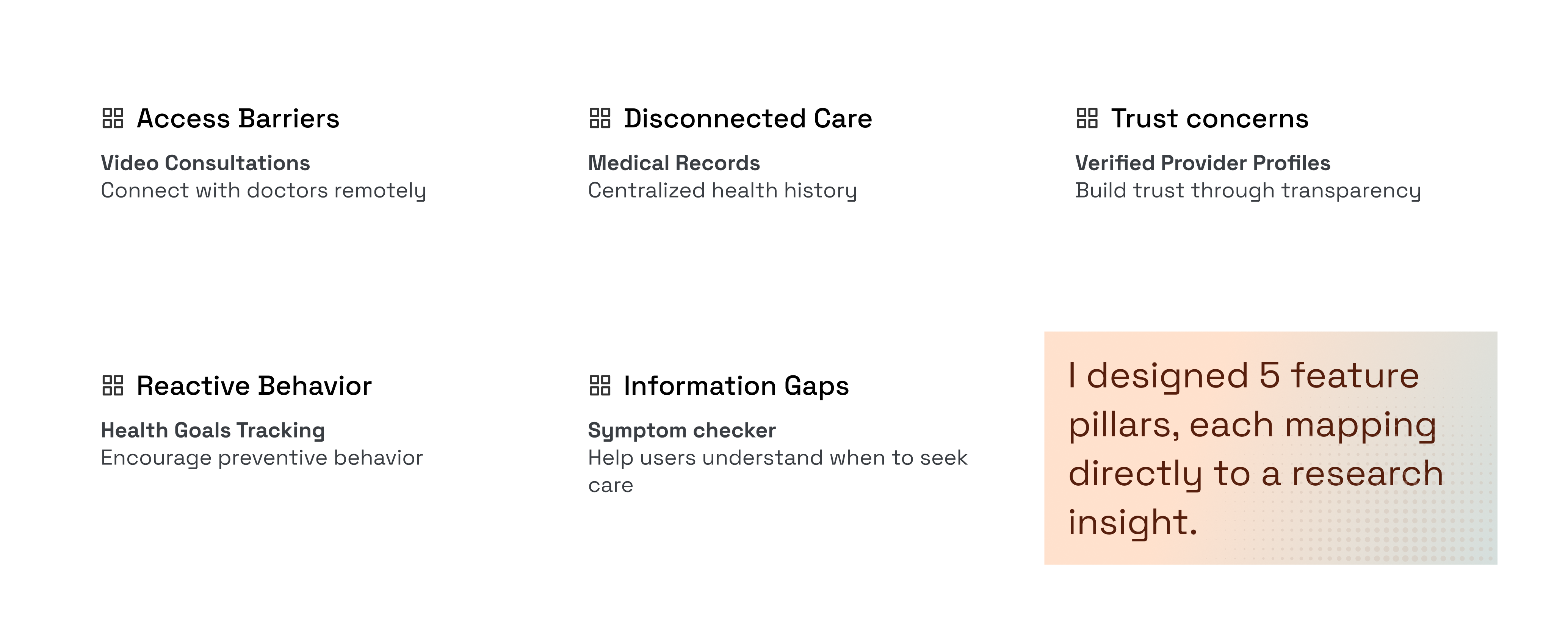
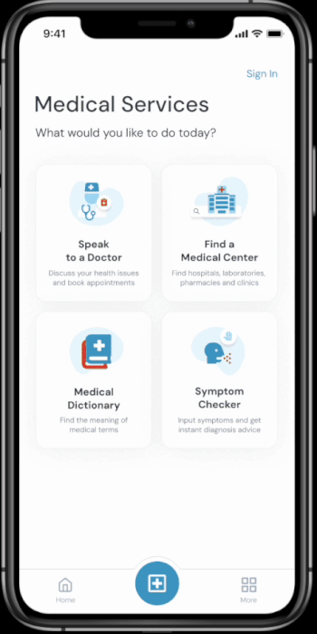
The 5-feature pillar
Conducted a workshop session with the PMs, Subject matter experts to define product features from our research and map them directly to the research insights.
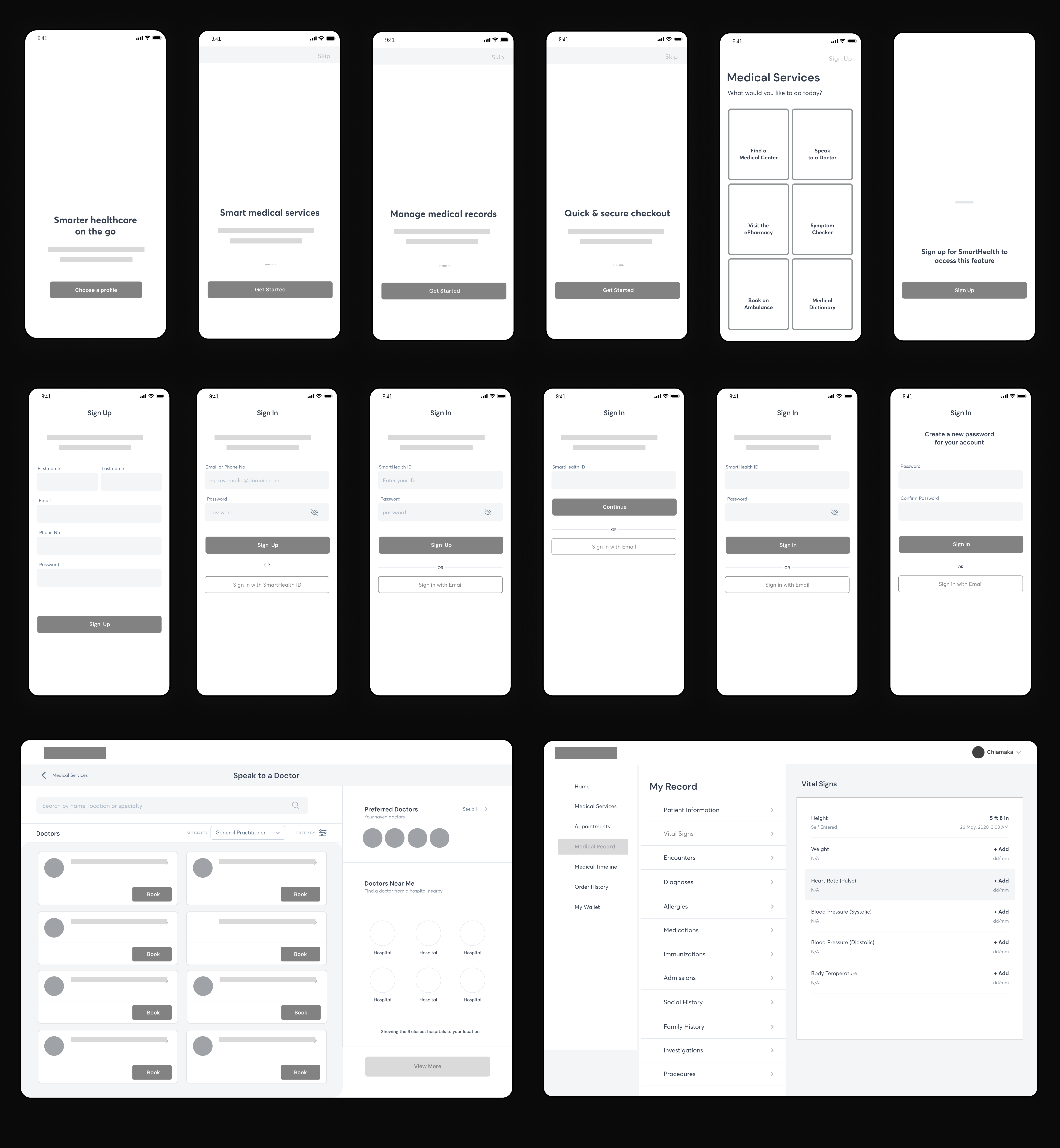
Low fidelity wireframe
Making use of the CLEAR framework as a guide to create low fidelity wireframes and user flow diagrams, I was able to visualize results of our research.
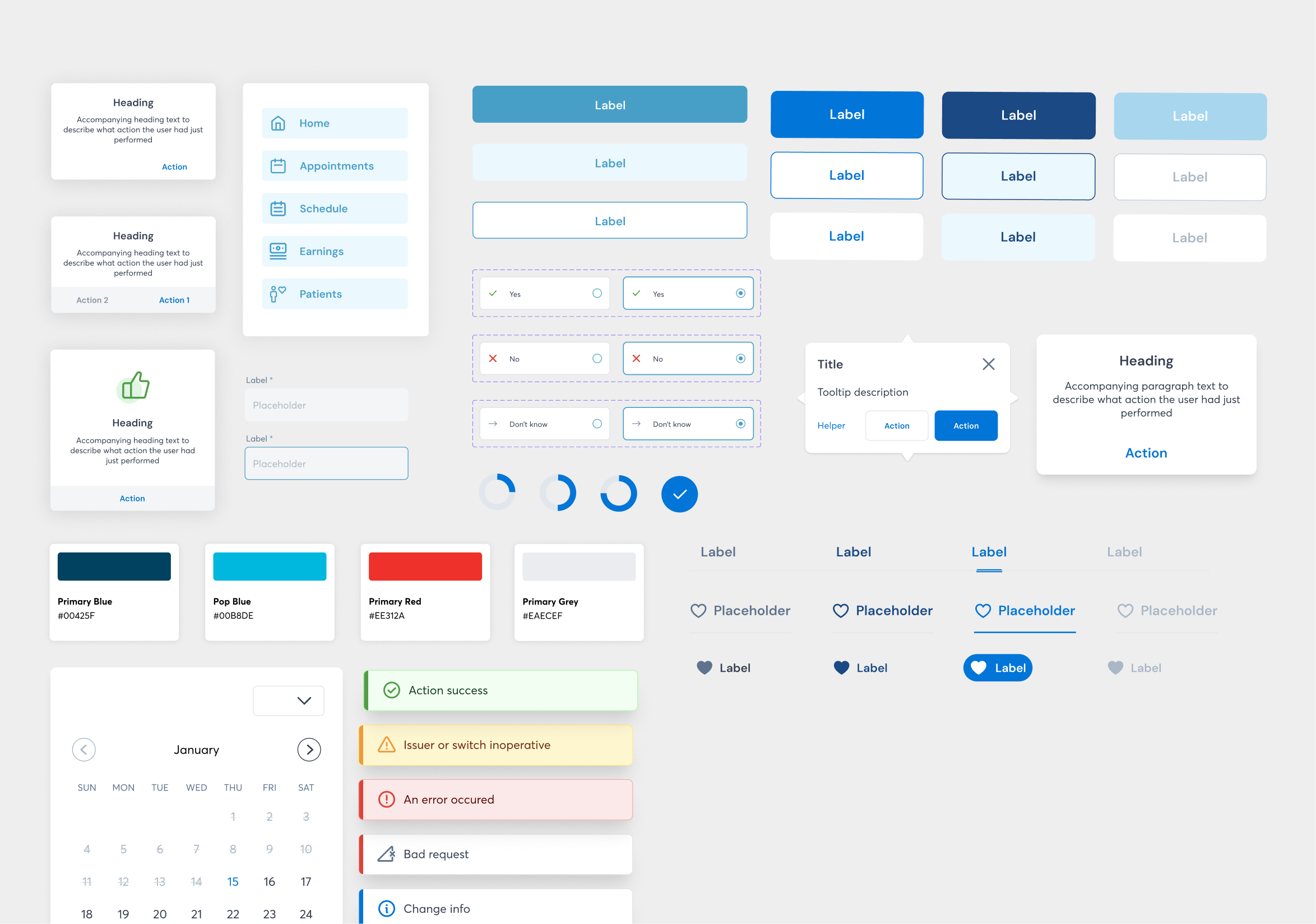
Design System
High Fidelity Design
After rounds of exploration and critiques with the team on key low fidelity designs were completed, I moved on to creating the high fidelity prototype - all addressing each of the 5-feature pillar
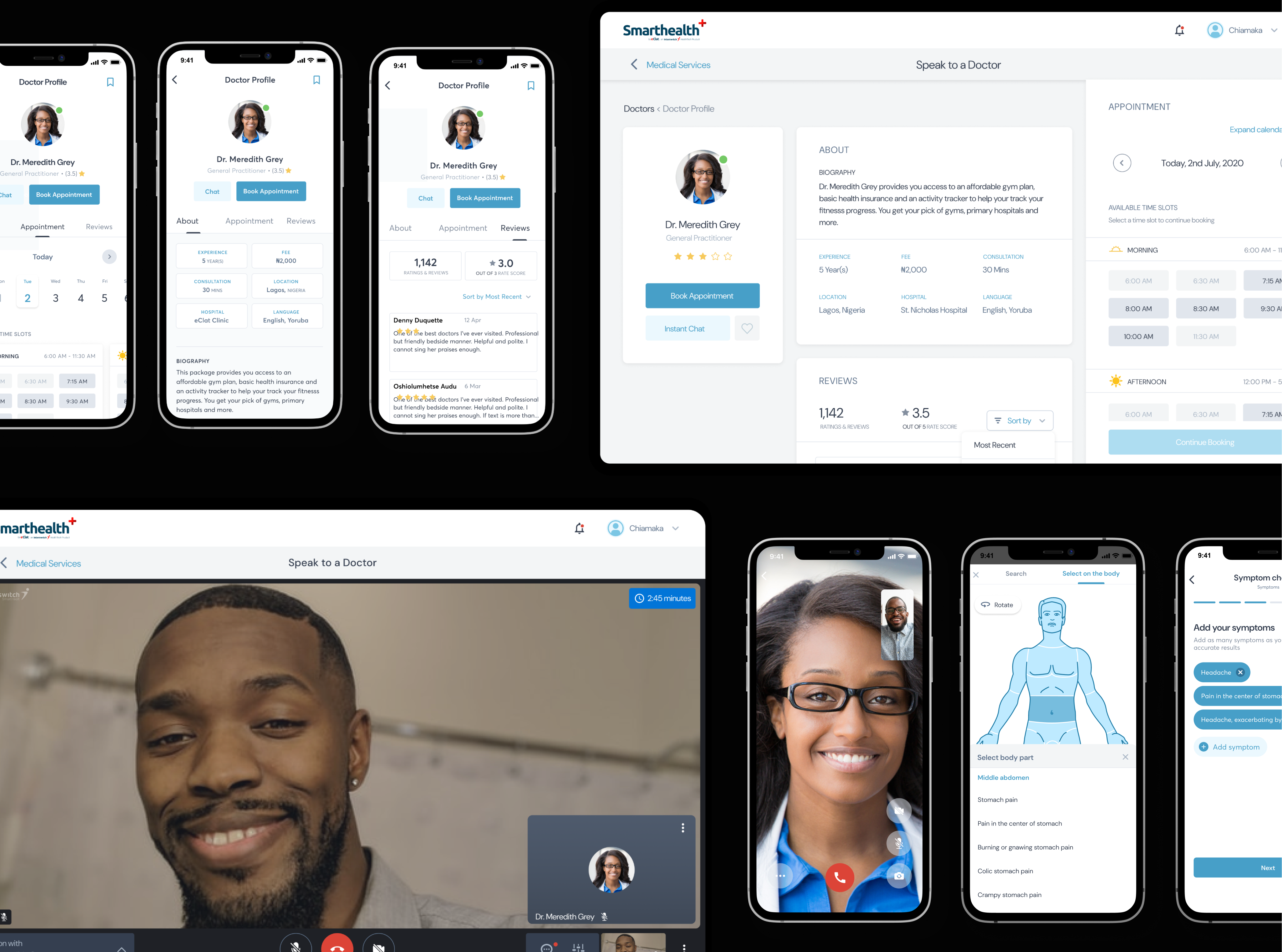
Speak to a Doctor
Prompt access to medical personnel or health care provider
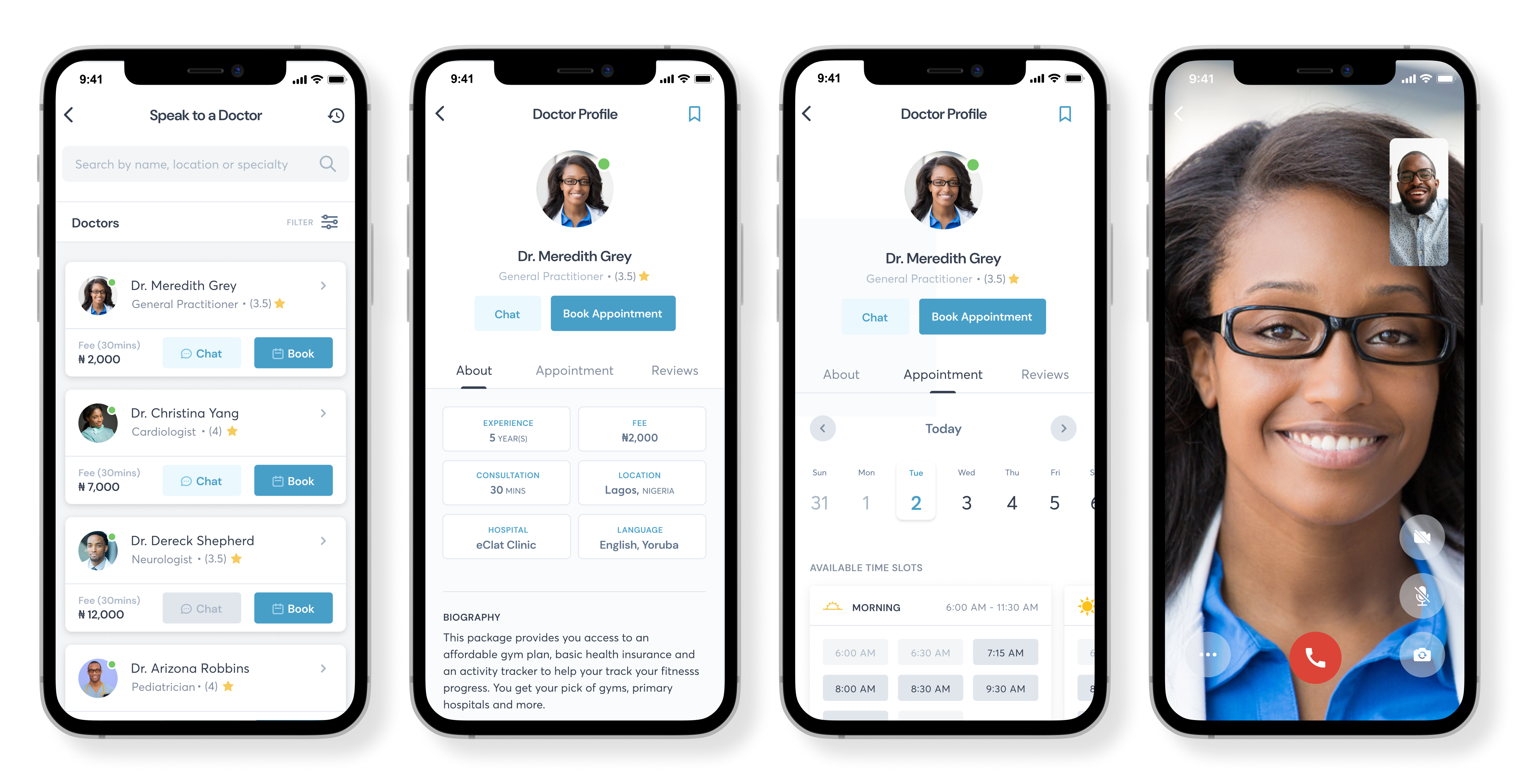
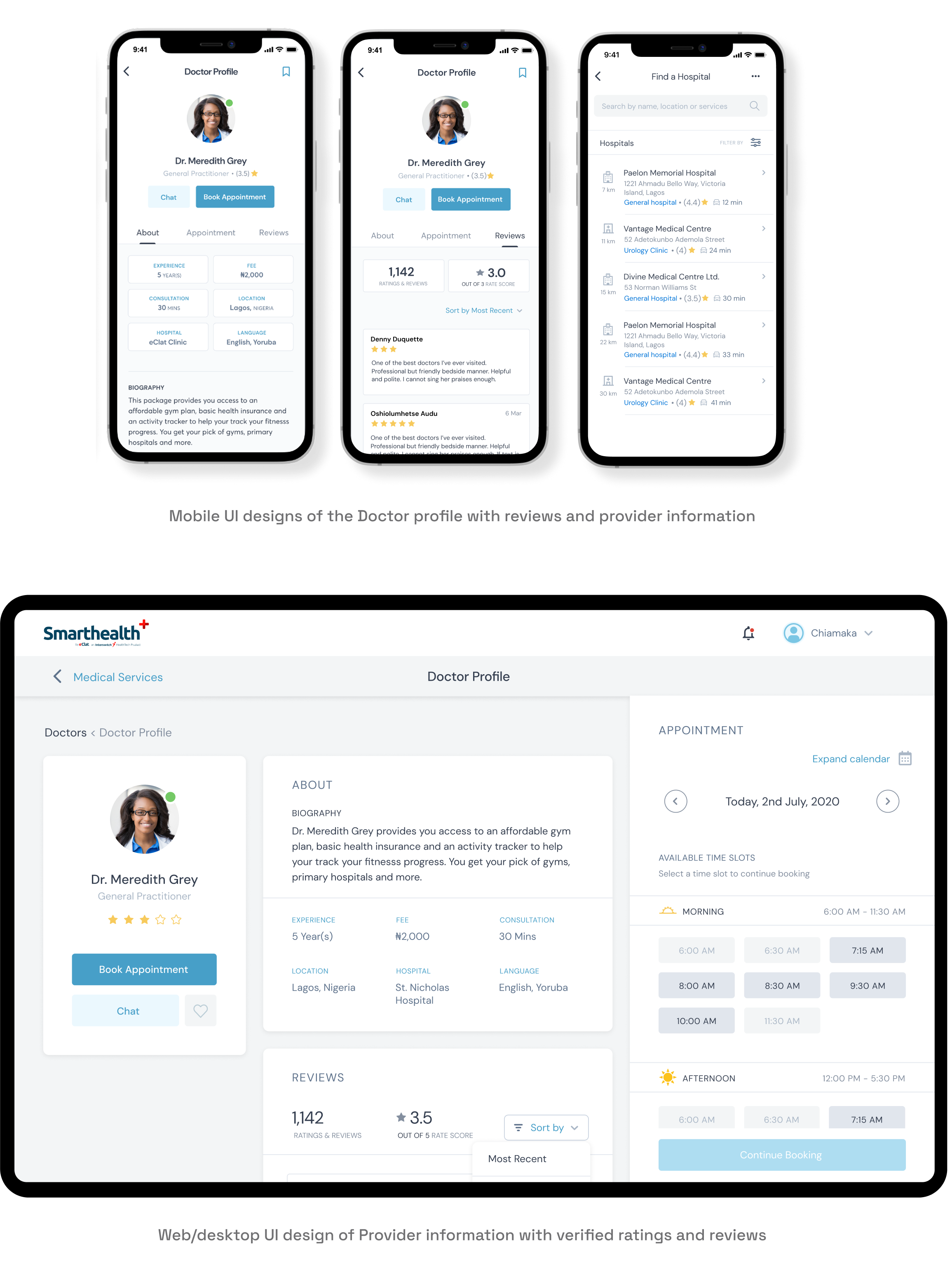
Verified Provider Profiles
Verified provider profiles to help provide and builds trust through transparency
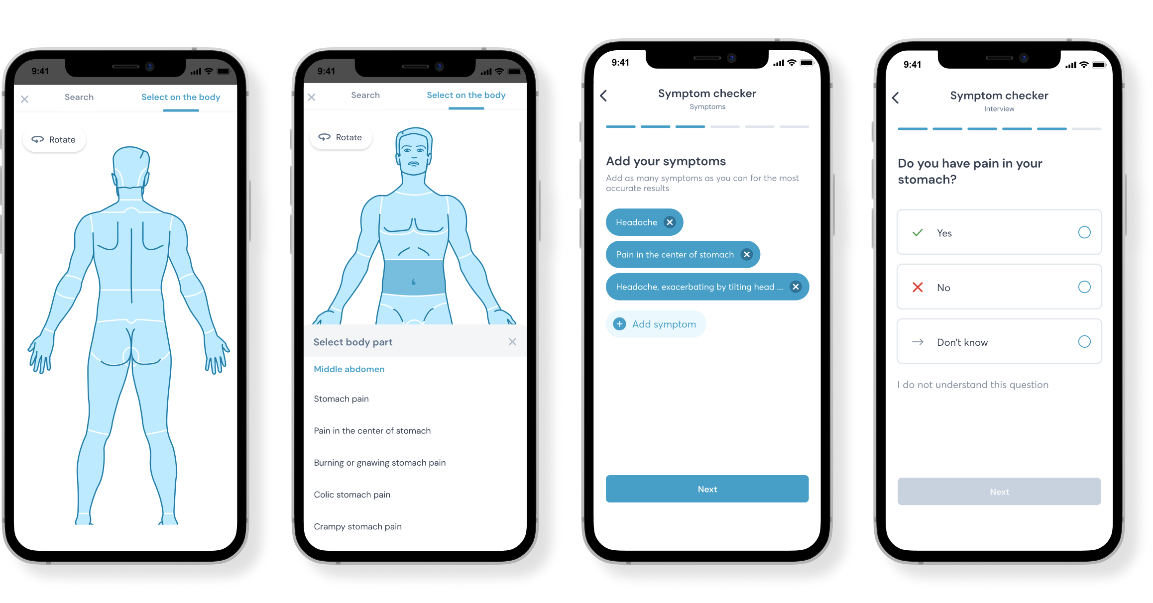
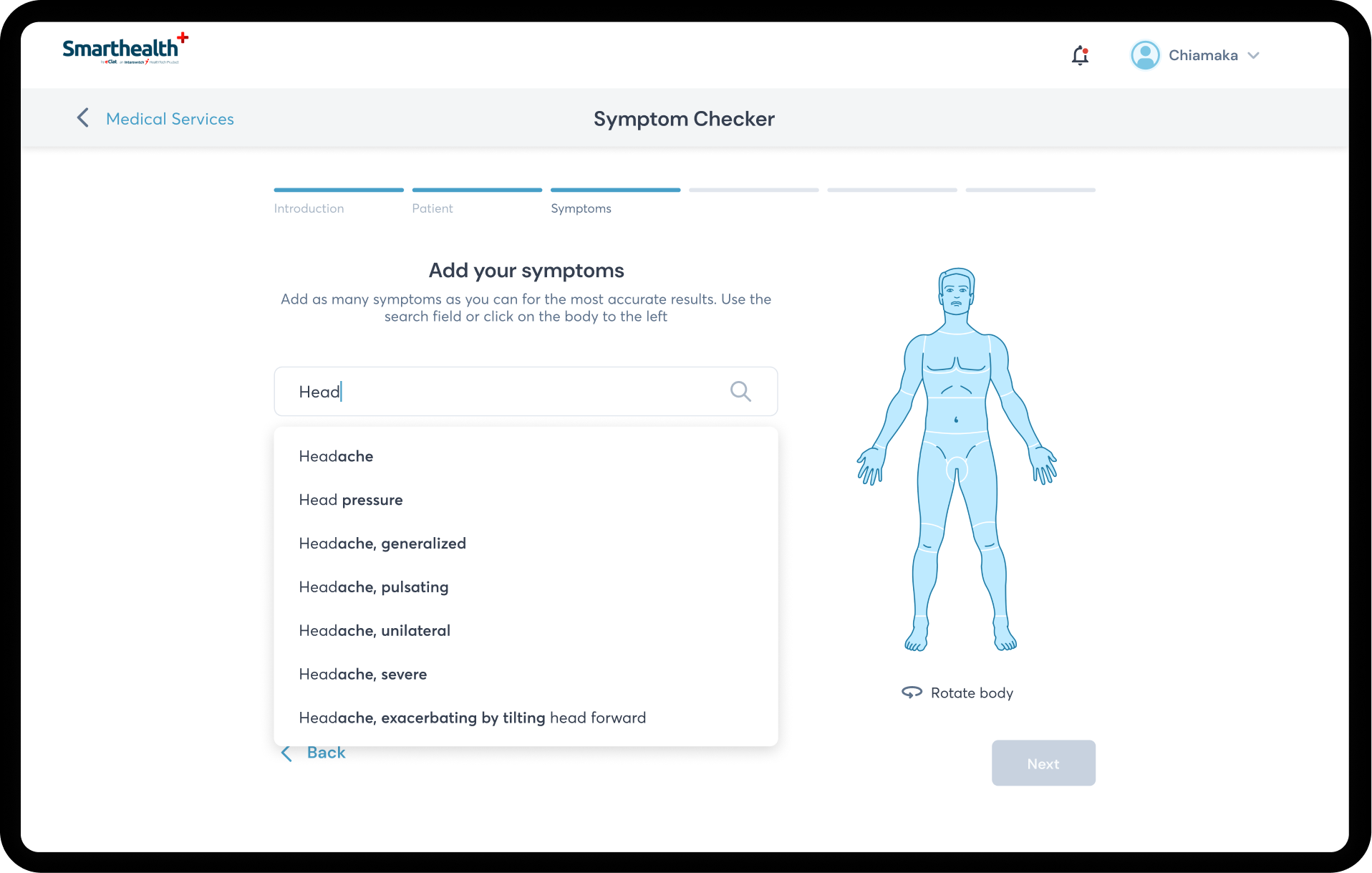
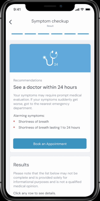
Symptom Checker
Dedicated symptom checker with predictive analysis with look up your symptoms to get an understanding of what may be wrong and get connected to a health care provider.
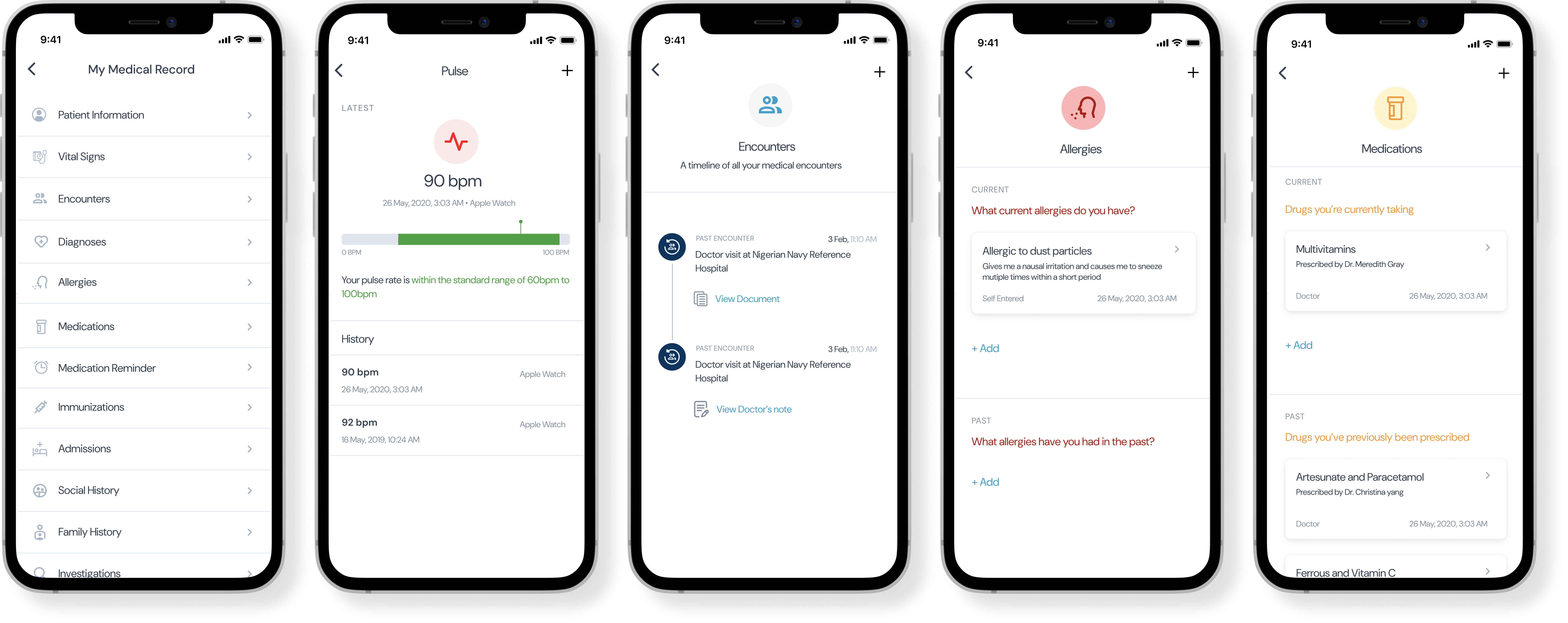
Medical Records
An environment that holds a record of patients medical records creates continuity of care and maintaining connection which each patient
Health goals tracking
Health goals tracking helps reinforce preventive behavior
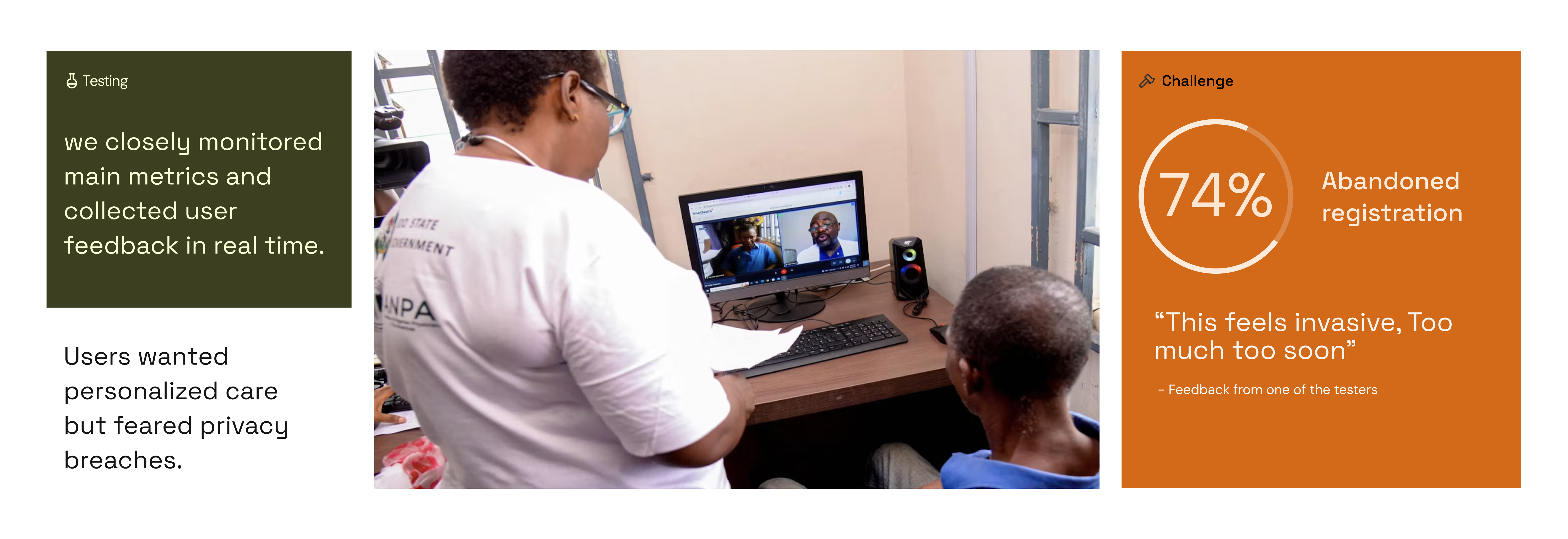
In the wild
Early prototype testing showed 73% abandonment on our registration form. This was Round 3 of usability testing with 18 users. We asked them to complete registration and book a consultation. 13 out of 18 abandoned at the medical history screen. When we interviewed them after, they said things like 'This feels invasive,' 'Too much too soon
Iterations
Rather than treating data privacy as a compliance checkbox, I reframed it as a trust-building opportunity. I worked with legal and security teams to develop a 'progressive trust' model where users start with minimal sharing and build confidence through transparency about how data is used.
Browse without Login
Starting off the progressive trust journey by providing value to user/patient without full comittance. User can view provider directory and medical centers in their area.
Basic medical recommendations
Level 2 progressive trust involves even more value through the symptom checker providing basic medical recommendations.
Account creation
Level 3 Now any other feature would require an account within the product to help rovide the best care for the patient.
.gif)
Share Medical Record
Level 4 progressive trust gets deeper and now at this point users can definitely continue with speaking to a doctor and now share their medical records with their doctor.
Outcome
Reflecting on the evidence
What i'd have done differently
Should Have prioritized Chat-First, Not Video-First:
Assumed video was the "premium" experience users wanted and Chat was afterthought, added after launch struggles
What Data Showed
60% of consultation volume became chat after we added it Chat users had higher satisfaction (NPS 67) vs. video (NPS 52)
What I'd Do Now
Start with research question: "What's the minimum tech for quality care?", then launch multi-modal from day one, let users choose - followed by testing in actual user environments (rural areas) earlier


Let's create
something
together
